
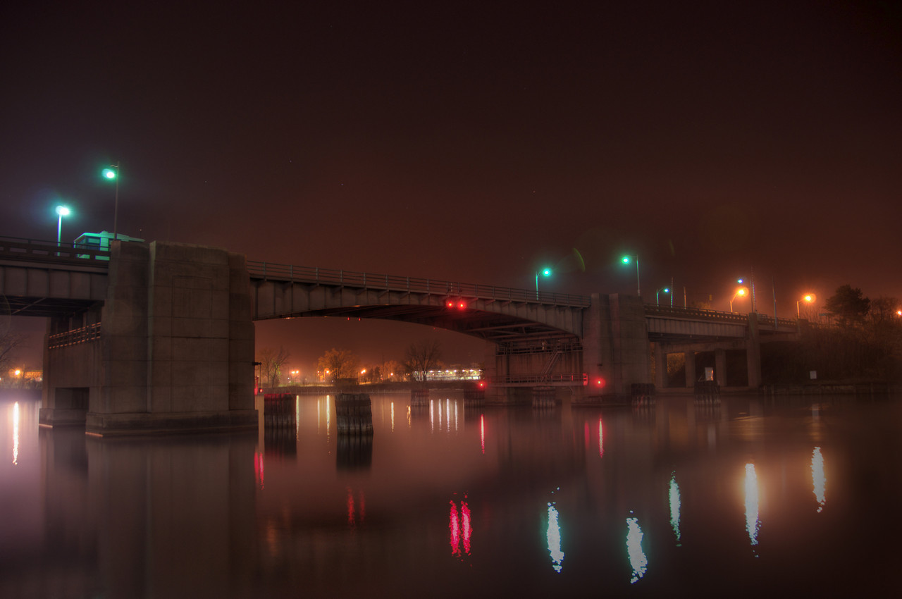
 Drawbridge at Midnight
None Shall Pass!
Stark, austere, industrial. This black and white photo of the St. Joseph bridge reminds me of a vintage 1950s picture.
I took this in the fall of 2010.
I don’t really remember how I got this photo without a ship in the shot as well. Normally they lower the bridge pretty quickly to avoid further disruptions to traffic flow, however since this was later at night, maybe the bridge operator was a bit slower at the switch.
This was of course originally taken in colour, but I thought that the black and white version provided a better feel.
Shades of Gray
One of my connections on twitter gave me some good feedback on my Drawbridge photo. I asked her if she wanted to see the colour version, and she said she did. So in addition to the “original” black and white version, I’ve added a colour version, and a sepia version.
Which do you like best?
Let me know in the comments section!
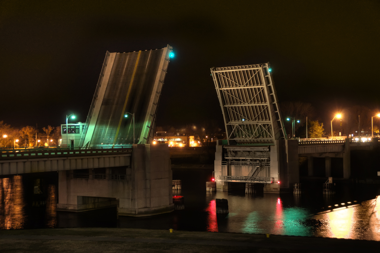
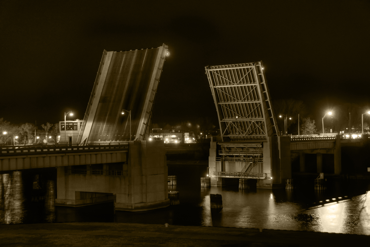

I think overall that I still like the BW one best, but I do like the vivid nature of the colored lights and their reflections on the water in HDR. The BW achieves a kind of timeless effect whereas the color version gives more of a sense of life and warmth. The sepia toned one doesn’t do much for me, though I can’t put my finger on why. Great work, and thanks for sharing the different versions!
I like the HDR color version best. The black and white looks foreboding to me.
Nice work!
It sounds like you went through a similar thought process I did when choosing the best photo, thanks for your comment Tricia.
And thanks Mom!